The power of orange - Perry Holt re-brand

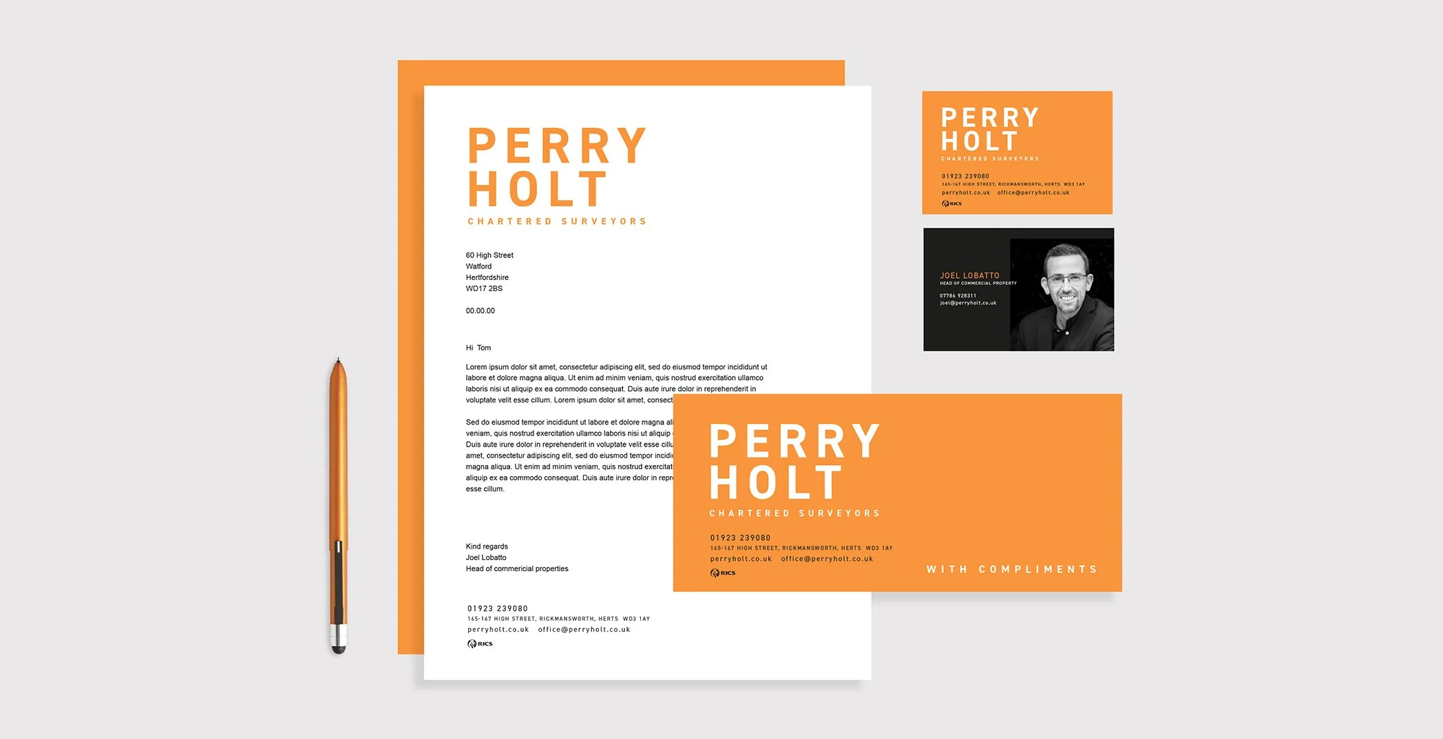
Creating brand standout for an established commercial property agency with a wealth of knowledge and experience accumulated over 20 years. Using the positive powers of orange to represent optimism, confidence, enthusiasm and warmth and build on its strong values to help clients realise their goals and aspirations. 

A clean, simple, impactful and innovative visual execution.

perryholt.co.uk

Brand positioning

Brand development

Brand communication

Website design

Brand guidelines

Artwork

Logo with text 'Perry Holt Chartered Surveyors' on an orange background.
Hand holding a smartphone displaying a property rental ad for a 2,817 sq. ft. office space with an image of the space. Next to it, an orange sign reading "Perry Holt Chartered Surveyors" with contact details and QR code for leasing a ground floor shop.
Street view with brick and white buildings, featuring signs from Perry Holt Chartered Surveyors, including 'To Let' and 'Sold' notices, and a shop sign for 'Switch Vapes.'
Screenshot of Perry Holt Property Consultants website on a laptop with an orange background, highlighting commercial and investment services.
Commercial property storefront with "To Let" sign by Perry Holt, featuring details like turnkey condition.
Modern business stationery set with letterhead, business cards, and pen on light background.
Commercial property brochure featuring a storefront with a "To Let" sign, interior office images, floor plan, and contact details for Perry Holt. Includes amenities and location information. Orange design elements are present throughout.
Flyer advertising a restaurant for lease in Rickmansworth, Hertfordshire, by Perry Holt. Includes property photos, floor plans, and contact details.